

This is an example of a 'responsive' web site theme. This means it 'adapts' itself to whatever size screen the user has, be it mobile, tablet, or wide screen desktop. it 'responds' to the size of the device, changing itself as needed. You can test this by changing the size of your browser window, dragging it to make it thinner, and watching how the website changes before your eyes, 'responding' to the new size, and still remaining very readable and browsable. Or, try visiting this page on a mobile phone, and see how it compares to the desktop version.
Hover your mouse over the menu above. It is a responsive 'Mega Menu', which is the ultimate, state-of-the-art web navigational system. Hovering over the different buttons above will show you many different offerings, including photo galleries, videos, and a contact form, all within the drop down menu! And if you resize your browser screen, to make it the width of a phone screen, you can see how the menu will change completely, yet still offer all the same items and features!
Our themes are hand-coded in pure CSS3, and thus do not need javascript. These days, many users use browser addons like 'noscript' to stop javascript, so it is always better to use themes that do not depent on javascript.
In addition, the majority of our hand-coded themes do not use or depend on any 'framework' (such as Zurb's Foundation, or Bootstrap). This gives you the ultimate in flexibility and options.
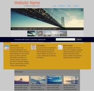
Full Featured Theme with Slideshow
This responsive theme has a 'Slider' automatic slide show (which can be stopped by user), a thumbnail gallery of 4 photos, a text block of 3 columns, and another block of 2 columns, with icons. It also has a fancy 3 column footer. And because it's fully 'responsive', all of this adapts well to whaterver screen size you're viewing, whether on a mobile phone or a giant wide screen computer.
Click the picture at left to view this theme 'live'.
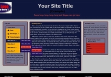
Three Column Theme with Sidebar 'Flyout' Menu
This responsive theme has a 'Slider' automatic slide show (which can be stopped by user), a thumbnail gallery of 4 photos, a text block of 3 columns, and another block of 2 columns, with icons. It also has a fancy 3 column footer. And because it's fully 'responsive', all of this adapts well to whaterver screen size you're viewing, whether on a mobile phone or a giant wide screen computer.
Click the picture at left to view this theme 'live'.
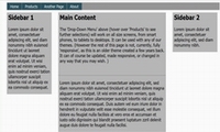
Simplest Theme, in Gray tones and Teal buttons
This is an older and simpler theme, in gray scale, with teal navigational buttons.
Click the picture at left to view this theme 'live'.